

Visibility is a User Experience
Designing a Seamless Experience from Code to Content

For the last few weeks, this project has been hidden behind a technical wall. I was focused on the “plumbing”, making sure the backend and frontend of my beta travel app were actually speaking the same language. It was a necessary phase, but it was also a comfortable one (once you learn what to do!). It’s easy to stay buried in the logic of a tool where things are either “broken” or “fixed.”
When the code finally worked, I had to shift and look at what I’d actually built. I realized a tool can be technically perfect and still be a failure if the person standing in front of it hesitates for a moment.
I have officially reached Version 1 of the Travel Email CoPilot. The “plumbing” is stable, but the most significant progress came from an audit of the flow. In marketing, we often think visibility is about being seen. My experience building this tool has reinforced a different truth: visibility is about being understood the moment someone lands on your page.
The Cost of Friction
If a user has to pause to figure out what a button does, you’ve lost them. I saw this clearly as I refined the interface. I had to move beyond functional and get to “seamless.”
To move this from a rough experiment to a presentable tool, I focused on several high-impact adjustments:
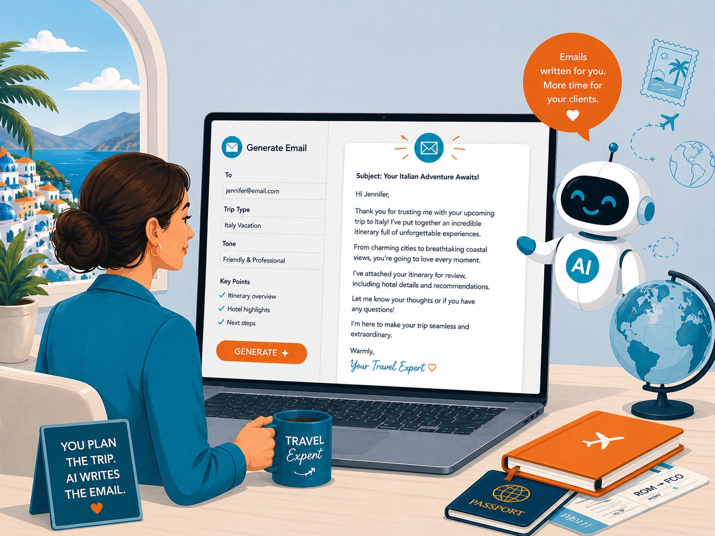
Establishing Instant Context: I added a clear tagline and hero image (created with ChatGPT’s upgraded image creator). Within two seconds, a visitor knows they are in a place designed to turn vendor content into client-ready emails.
Visual Authority: I moved the form into a card layout and upgraded the typography to Poppins and Inter. Clean design is more than aesthetics; it signals to the user that the tool is reliable and professional.
Descriptive Direction: I replaced generic labels like “Tone” with specific examples like “warm, personal, polished.” This removes the “blank page” syndrome and tells the user exactly how to succeed.
A Four-Step Path: I mapped out the entire process into four distinct actions: paste, choose, generate, and copy.
Your Content is an Interface
We often treat our emails and LinkedIn posts as static text, but they are actually interfaces. Your reader is “using” your content to get to an insight or a solution. If your message is cluttered or your call to action is buried, you are creating a high-friction experience.
Expertise shows up in the details. It’s the difference between a rambling update and a streamlined system that respects the reader’s time. When you remove the friction from your communication, you aren’t just “marketing” you are providing a service.
I’m finalizing the visual touches before learning how to deploy the CoPilot for testing. This project is a reminder the systems we build, whether they are apps or newsletters, only work if we design them for the human on the other side of the screen.
If you’ve ever wondered why some of your best content doesn’t get the engagement it deserves, the answer usually lies in the “hidden friction” of your delivery.

Previous Articles From My AI Building Experiment


How to Audit Your Content for Flow Friction
Most business owners are too close to their own work to see where it breaks down. We fill in the gaps with our own knowledge, forgetting our audience is seeing it for the first time. To fix this, you have to look at your writing through a “UX lens.”
Keep reading with a 7-day free trial
Subscribe to Your Visibility Edge to keep reading this post and get 7 days of free access to the full post archives.