

Most Tools Don’t Get Used
What I changed after getting stuck at 80%


Last time I wrote about this, I was stuck.
In my last article, I shared the early stage of building a simple tool to help turn supplier content into better emails. I kept it intentionally small so I could get it done and see if it worked. That approach got me close to the finish line. Then I hit a wall that forced me to look at the project differently.
The backend worked. The interface existed. But they weren’t talking to each other. A CORS error had me at 80% and unable to move forward. I spent a bit of time trying to fix it, then stepped back and looked at something else.
I kept coming back to what someone would see if they landed on the page. Not the architecture. The experience. That’s where my attention shifted.
What I started changing
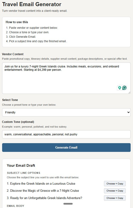
I went back to the interface and looked at how someone would move through it for the first time. I rewrote the instructions, moved the steps into a clearer order, added examples inside the fields, and changed the button labels so they describe what happens next.
These are small changes, but they change how quickly someone settles in and starts using it.
The moment it became clearer
I added a short box at the top:
“How to use this”
Paste your content
Select a tone
Click generate
Choose and copy
Writing those four steps slowed me down. I had to walk through it as if I hadn’t built it, as if I didn’t already know what each part did.
Where hesitation shows up
One field made this obvious.
The tone input originally said, “Choose a preset or enter your own.” It read fine, but there was a pause there.
I changed it to “Select a tone or type your own” and added an example: “warm, personal, polished, not too salesy.” That example does more than the label because it shows what to do without extra explanation.
What this changed for me
Working on the interface started to shape how I think about the tool. Each word, each step, each example plays a role in whether someone continues or stops. You don’t see that in the structure behind the scenes. You see it in how the experience feels.
And, this where expertise comes into play. I’ve been marketing online since 1996. I know what works and what doesn’t. I don’t rely on the AI to make the decisions. Those are mine, based on experience.
How this connects to your visibility
The same pattern shows up in content. Someone lands on a post, a page, or an email without context and decides quickly whether to keep going. Clarity and flow carry more weight than we expect.
The question that usually comes next is: how do I know where people are getting stuck?
Read your content after a day or two, or read it out loud. The spots where you slow down or feel unsure are often the same spots your reader will hit.
What to look at this week
Take one piece of your content and read it straight through. Notice where you pause, reread, or feel unsure what comes next. That’s where the work is.
What I’ve shared here is the shift in how I think about this.
Below, I break down how to do this with your own content with a simple prompt to test where people hesitate and what to change first.
Keep reading with a 7-day free trial
Subscribe to Your Visibility Edge to keep reading this post and get 7 days of free access to the full post archives.